SIGNS ARE THERE FOR A REASON

speed_limitx

The Buick campaign featured real people who have been injured by reckless drivers. They stood at the exact location where the accident happened and held up the exact road signs those driver had ignored. The woman in this ad, Chen Shi Hui lost her arm while riding in a speeding bus that flipped.

This PSA ad is effective because it evokes fear amongst drivers on the road. Every time they choose to go over the speed limit, they are immediately putting someone else’s life in danger. Although there is no headline to indicate the message of the ad, it is evident in the picture itself. The woman holding up the speed limit sign is the main focus as she is there to attract people’s attention. Moreover, the audience can tell that she does not have a left arm which indicates that she was either in an accident for speeding or was a victim of an accident. The description below “injured while riding in a speeding bus that flipped” explained that she was a victim of an accident which leaves a stronger impact on the audience. It tells them that they should obey the road signs because they are there for a reason and that is to avoid tragic accidents.

Written by Gan Lay Ann

What Type Are You?

Blood Donation Ad Campaign

blood

The picture shown above is an ad campaign promoting blood donation. The print ad is in Spanish and the campaign started out in the province of Alicante, Spain.

The headline of the print ad translates to “What is in your veins?”. A new headline for the print ad can be “What Type Are You?“. The headline not only dictates the type of blood a reader would have but also, the type of person they are. The headline has a double meaning to show audiences that they can donate blood and also to input a guilt feeling to audiences that try to ignore the ad.

The body copy of the print ad mentions how only 3% of the population in Alicante have access to blood. A better body copy can be “Every day, people are dying from low supply of blood“. This continues the feeling of guilt by telling the audience that people are dying from loss of blood.

The call to action that would have a good impact is “Save a life today“. This triggers the thought within an individual that they have an opportunity to save a person’s life by donating blood. It has the potential to create an altruistic behaviour within a person. The call to action can eradicate an individual’s guilty feeling by having the thought of being able to save a person’s life.

Written by Syed Mukmin

BADVERTISING

An effective billboard advertisement requires for it to be big, clear, eye catching and concise. When making a billboard ad, it is important to keep in mind that drivers on the road are driving at about 50km/hr thus they need to catch what is being advertised at first glance. A good billboard is simple, creative and easy to read for people to know what the brand message is.

billboard_bad.jpg

(Image Source: WordPress)

The billboard ad above advertise for a family lawyer. However, a driver won’t get that information right away as it is too cluttered with words. In order  to be effective, the number of words has to be reduced to seven or less (Hampton, 2013)  to keep it simple and precise, something like “Fighting over custody? Judge Blockman to the rescue.”

Aside from that, colour contrast is important as it can either catch your attention or blend in with the surroundings. The billboard uses one too many colours therefore the contrast becomes dull and boring, failing to show the focus of the message. The billboard should use creative, edgy artworks of a child that can impact the audience, making it memorable.

In addition, the billboard displays a phone number which is quite ineffective especially in billboards since drivers don’t have the time to take it down or take a picture. Instead, the name or logo of the company can be shown so drivers can remember to look it up when they’re free.

As a conclusion, an effective ad must be simple, creative and concise because a billboard has roughly 5 seconds to catch a drivers attention.

Below is an example of a good billboard ad:

0279a1057b9be4d700f5c9063a43e4ae--billboard-design-divorce.jpg

(Image source: Pinterest)


References

Hampton, J. (2013) Making an Impact in 7 Words or Less | Quantum Communications | Advertising + Marketing Agency | Louisville, Kentucky. [online] Quantum Communications | Advertising + Marketing Agency | Louisville, Kentucky. Available at: http://qtheagency.com/making-impact-7-words-less/ [Accessed 11 November 2017].


Written  by Averille Goh Qiaowen

Tips on writing a brilliant billboard

The convergence has played a major part in almost all facets of life including how advertising is done. Nowadays, advertisements are more in line with the technological advances that are available today. Despite this, billboard ads are still considered to be a very relevant type of advertising that is still influential to the masses. Here are some tips for writing a good body copy:

Stay True to The Message

It is very easy when trying to write a body copy for the billboard to get carried away and make your message convoluted. Losing the message causes you to lose the attention of your target audience.


Be Mindful of Technology

Nowadays, a lot of the traditional billboards have been replaced by electronic billboards which allow a  higher level of interactivity with your target audience. So writing as if you are writing for a traditional billboard will cause you to miss out on creating a more attractive body text with the effects that electronic billboards allow you.


Use of Fonts

Font size and type play a major part in writing a good body copy whether for traditional billboards or electronic billboards. The use of sans or sans serif fonts could make or break your body copy in terms of its ability to attract the eye of your target audience.


Be Punny

Nothing is more attractive or entertaining for audiences then when they see a well written pun in a billboard advertisement. Not only does it attract your target audience, but it gives them a good impression of the brand that sponsored the billboard.


Written by Eidil Fitri

Stranger Things 2 is what you should be watching this Halloween.

Stranger things ad

(Image source: Facebook)

Drop whatever you’re doing and get your popcorn for the newly anticipated season of the Netflix hit, Stranger Things season 2. The long and painful wait is over. It has been more than a year since the last season of Stranger Things and this season, “Things” get “Stranger”. The adorable group of kids are back as they continue on their journey to solve mysteries within the seemingly quiet town of Hawkin. Follow Mike, Dustin, Lucas and Will as they uncover new discoveries and overcome strenuous challenges.

Stranger Things fall under the genre of Mystery and Horror. If you do not like these types of shows, then fear no more. The show caters to multiple segments of audiences. Does it portray memorable characters? Yes. Does it contain a love story? Yes. Is it a coming of age story? Yes. Does it have a lot of 80’s culture references? Definitely! It had multiple themes to the show that can interest people of all ages. So why wait? Stranger Things is only available on Netflix so, go watch it now or go watch it with your friend’s account now.

Written by Syed Mukmin

A good or bad Facebook advertisement?

dollar shave club

(Image source: WordStream)

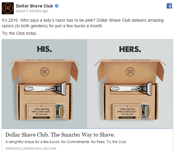
The above Dollar Shave Club Facebook advertisement caught my attention as it was appealing enough and looks interesting to one’s eyes. It is considered a good advertisement because it included all the necessary components and has an aesthetic, simple image of the product. It targets men and women who uses razor regularly.

The lead line starts off with a question that pain-point the audience about women’s razor being pink. It addresses people’s problem and in this case, regarding gender stereotype thinking. It also provided what the brand delivers with a certain amount of money in a certain time frame. In addition, call to action is given in the ‘read more’ section. The headline is good too as it tells people that using the product is the smartest way. Moreover, the description includes the benefits and reasons why the offer cannot be missed. Basically, it is straightforward and easy to understand for the audience. However, a call to action button is not included at the bottom of the advertisement instead there is a link of the brand’s website stated. 

Written by Chua Jing Wen

Copywriting Tips for Product Packaging

As a copywriter, it is important that your copywriting is able to make a big impact to audiences without a lot of time or space especially when it comes to product packaging. Here are a few tips to become a better package copywriter.

Font Matters: No matter how creative or compelling your package design is, it all goes down the drain if shoppers struggle to read whats on the label. The goal is to make sure your font is bold enough that is readable. The font you choose should also match your brand style so that it is more identifiable for shoppers.

Be Brief: A good copywriter knows that a few lines could mean the difference between nice looking line breaks and an unsexy jumble of words. People prefer to read something that is concise and easy to digest or you risk losing their attention.

Benefits First: When it comes down to it, the question that needs to be answered for the consumers is “What’s in it for me?”. Load your front sentences with the important benefits of the product and fill the back with the features of the product.

Use Persuasive Language: The language that you use to sell your products or services can have a big impact on whether or not people will buy from you. As consumers, we’re constantly placing ourselves at the forefront of the narrative.


Written by Eidil Fitri bin Ahmad Nazari

Ingredient Copy in an Interesting Writing Style


Screen Shot 2017-10-15 at 6.22.38 PM.png

(Image source: savingmoneyplan)

Lipton White Tea with Blueberry & Pomegranate

Let this dark berry infusion calm your senses. The delicate blend of real blackberry, apples, orange, blackcurrant, blueberry, raspberry, rosehip and pomegranate fruit will provide a tangy and sweet sensation that will linger in your mouth. The spicy flavours of cinnamon, licorice, chicory and ginger will provide the calm amongst the intensity and richness of the dark berries. Last infused with the flavours of white tea and green tea creating an incredible blend that is hard not to love. Pyramid tea bags gives the ingredients more space to release its true flavours into your cup. Enjoy any time of the day for a berry unique fruity and spicy experience.


Written by Gan Lay Ann

The Laddering Process

Laddering is a five element process used by brands to translate product features into brand’s benefit and value and they consist of attribute, feature, product benefit, customer benefit and value.

1. Attribute is used to describe a service or a product characteristic. This elements helps to distinguish your product from another in the market through differentiation that can be tangible or intangible.

2. Feature is used to describe the quality, detail or function of the brand. Using this element shows your consumers the strengths, differences and unique offerings the product has to offer.

3. Product benefit is what consumers are able get out of your product. This elements helps make an implicit claim of superiority in a competitive market such as by saying that your product is the best in the market and preferred by everyone.

4. Customer benefit is the consumer’s reward from a brand and how the product makes them feel after they have purchased it. This elements will give a solution to your consumers through facts of the product.

5. Value is an emotional feeling that can bind a brand with their target audience through shared beliefs. This element is important to provide a sense of security and purpose for consumers of a brand to build long term loyalty.


b4520d09164e9abb1152615a24a60e5d.jpg

Ladder example:

(Image source: Google)


Written by Averille Goh Qiaowen

Feature benefits of the product copy

dovemult01

(Image source: Ads of the World)

This creative product print advertisement from Dove has some good features stated. First, it uses a famous American animated sitcom character from the The Simpsons, Marge as the model of the hair product. It shows that the new Dove Anti-Frizz Cream will make any type of hair even Marge Simpson’s big, frizzy hair look smooth and wavy. Audiences that knows the The Simpsons and women that have long frizzy hair will definitely be able to relate. The advertisement also included other feature benefits of the product like it makes the hair not only smooth but also shiny and grease-free. Sometimes it is better to give more information of the product on the advertisement to let the customers know what they are actually looking for in the product they desire. Besides that, Dove uses a tagline to capture the essence of its brand’s promised consumer benefit.  The tagline of the ad  is “Unstick your style”, helps strengthen the customer’s memory of the advertisement product.

Written by Chua Jing Wen